Category: Design Elements

  • Web Design Trends 2017 – Stronger Focus on Mobile First

    Web Design Trends 2017 – Stronger Focus on Mobile First

    Reading Time: 3 minutes

    [et_pb_section bb_built=”1″ admin_label=”Section” fullwidth=”on” specialty=”off”][et_pb_fullwidth_post_title admin_label=”Fullwidth Post Title” title=”on” meta=”on” author=”on” date=”on” categories=”on” comments=”on” featured_image=”on” featured_placement=”background” parallax_effect=”on” parallax_method=”on” text_orientation=”center” text_color=”light” text_background=”on” text_bg_color=”rgba(0,0,0,0.5)” use_border_color=”off” border_color=”#ffffff” border_style=”solid” custom_padding=”320px||320px|” title_font_size=”52px” title_font_size_phone=”42px” title_font_size_last_edited=”on|phone” /][/et_pb_section][et_pb_section bb_built=”1″ admin_label=”Section” fullwidth=”off” specialty=”off”][et_pb_row admin_label=”Row” make_fullwidth=”off” use_custom_width=”off” width_unit=”on” use_custom_gutter=”off” allow_player_pause=”off” parallax=”off” parallax_method=”off” make_equal=”off” parallax_1=”off” parallax_method_1=”off” custom_padding=”40px|80px|40px|80px” parallax_2=”off” parallax_method_2=”off” custom_padding_tablet=”20px|0px|20px|0px” custom_padding_last_edited=”on|phone”][et_pb_column type=”4_4″][et_pb_text admin_label=”Text” background_layout=”light” text_orientation=”left” use_border_color=”off” border_color=”#ffffff” border_style=”solid”]

    The day of websites not formatting correctly on mobile devices is over. The majority of reader’s access websites on mobile devices. If today’s layouts don’t work perfectly on mobile the website will lose traffic and readership. For this reason many designers are designing websites for mobile first. In other words, a website would be designed for mobile screens before being designed for desktop screens. This keeps mobile in the forefront rather than being tacked on last or forgotten completely.

    The design methods of the olden days of web design (last year) was to design a layout or a theme and test it in a few browsers. Once the designer was satisfied that it worked on the popular browsers the website would go live. The problem is the designer didn’t always test it on mobile, so it wouldn’t always get optimized for small screens. Many sites weren’t even responsive until a year or so ago.

    Whether you design on mobile and scale to desktop, or design on desktop and scale to mobile, the website must work perfectly on both. My advice is to use a theme that’s mobile-ready and test on as many devices as you can. Divi is a great chioce. As Zurb demonstrates, creating a site for mobile and scaling up to desktop is better than creating for desktop and scaling down to mobile.

    For more stats on mobile usage see the article Mobile Marketing Statistics compilation from Smart Insights.

    How to Test for Mobile Optimization

    My preferred tool is Google Chrome Tools. If you’re using Chrome, right click anywhere on a website and select Inspect. This will open the tools. The will open a tool box either on the right or on the bottom portion of the screen. Select Toggle Device Toolbar if it’s not already showing in the left portion or at the top.

    The webpage you’re viewing will show in a simulated mobile device. Choose a device to test in both portrait and landscape mode. Be sure to test as many devices as you can.

    Once you’re satisfied with how your website looks in the simulated mobile devices, load the website on as many actual devices as you can.

    Another tool I like is Am I Responsive. Enter your URL and it will show your website on multiple screen sizes and you can scroll through them.

    Let’s Discuss

    • Do you build for mobile first?
    • Do you prefer to scale up to desktop or scale down to mobile?
    • What are your favorite tools for developing and testing for mobile?

    Let us know what you think in the comments. Thanks for reading and please subscribe if you haven’t already. 

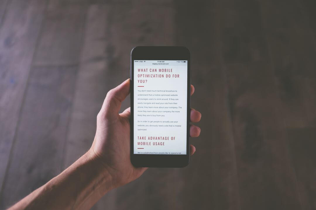
    Featured image by NeONBRAND

    [/et_pb_text][/et_pb_column][/et_pb_row][/et_pb_section]

  • WordPress Design Trends 2017 – Improved Micro-interactions

    WordPress Design Trends 2017 – Improved Micro-interactions

    Reading Time: 2 minutes

    [et_pb_section bb_built=”1″ admin_label=”Section” fullwidth=”on” specialty=”off”][et_pb_fullwidth_post_title admin_label=”Fullwidth Post Title” title=”on” meta=”on” author=”on” date=”on” categories=”on” comments=”on” featured_image=”on” featured_placement=”background” parallax_effect=”on” parallax_method=”on” text_orientation=”center” text_color=”light” text_background=”on” text_bg_color=”rgba(0,0,0,0.5)” use_border_color=”off” border_color=”#ffffff” border_style=”solid” custom_padding=”320px||320px|” title_font_size=”52px” title_font_size_phone=”42px” title_font_size_last_edited=”on|phone” /][/et_pb_section][et_pb_section bb_built=”1″ admin_label=”Section” fullwidth=”off” specialty=”off”][et_pb_row admin_label=”Row” make_fullwidth=”off” use_custom_width=”off” width_unit=”on” use_custom_gutter=”off” allow_player_pause=”off” parallax=”off” parallax_method=”off” make_equal=”off” parallax_1=”off” parallax_method_1=”off” custom_padding=”40px|80px|40px|80px” parallax_2=”off” parallax_method_2=”off” custom_padding_tablet=”20px|0px|20px|0px” custom_padding_last_edited=”on|phone”][et_pb_column type=”4_4″][et_pb_text admin_label=”Text” background_layout=”light” text_orientation=”left” use_border_color=”off” border_color=”#ffffff” border_style=”solid”]

    Micro-interactions are small animations and effects to indicate when an event is happening. They’re great for showing that something is clickable and for indicating that the user’s actions were recognized. I personally hate it when I hover over something and it doesn’t show me that I can click on it and then when I do it doesn’t show me that it took the click. Micro-interactions greatly improve the usability of a website and they’re becoming even more popular.

    An example in the real world include the tiny vibration you feel when you click on a button on your smart-phone. You know that it took your click because of that vibration. You’ll also see an animation on the button itself such as the button changing color or becoming larger and then shrinking back to normal.

    An example in the virtual world would be hovering your mouse over a menu item on a website you’ll see an effect that indicates the post is clickable. A good example is the menu of Web Design Depot.

    These micro-interactions are useful for:

    • buttons
    • menus
    • status
    • changes
    • call to action
    • messages as the result of an action
    • visual input
    • typing indication
    • feedback
    • toggling something on or off
    • etc.

    CSS Animation

    Hover Effects Builder – WordPress Plugin

    You can tell from the image above what is being clicked by its hover animation.

    Most of these micro-interactions are in the form of CSS animation and can be created with CSS tools or with plugins. Here are a few resources to help you create them:

    Use as many as you can but keep them simple, consistent, and easy to understand.

    Let’s Discuss

    • Do you use micro-interactions?
    • What are your favorite micro-interactions?
    • What are your favorite tools for creating them?

    Let us know what you think about micro-interactions in the comments below. Thanks for reading and please subscribe if you haven’t already. 

    Featured image by Samson Vowles

    [/et_pb_text][/et_pb_column][/et_pb_row][/et_pb_section]

  • WordPress Design Trends 2017 – Gradients

    WordPress Design Trends 2017 – Gradients

    Reading Time: 2 minutes

    [et_pb_section bb_built=”1″ admin_label=”Section” fullwidth=”on” specialty=”off”][et_pb_fullwidth_post_title admin_label=”Fullwidth Post Title” title=”on” meta=”on” author=”on” date=”on” categories=”on” comments=”on” featured_image=”on” featured_placement=”background” parallax_effect=”on” parallax_method=”on” text_orientation=”center” text_color=”light” text_background=”on” text_bg_color=”rgba(0,0,0,0.5)” use_border_color=”off” border_color=”#ffffff” border_style=”solid” custom_padding=”320px||320px|” title_font_size=”52px” title_font_size_phone=”42px” title_font_size_last_edited=”on|phone” /][/et_pb_section][et_pb_section bb_built=”1″ admin_label=”Section” fullwidth=”off” specialty=”off”][et_pb_row admin_label=”Row” make_fullwidth=”off” use_custom_width=”off” width_unit=”on” use_custom_gutter=”off” allow_player_pause=”off” parallax=”off” parallax_method=”off” make_equal=”off” parallax_1=”off” parallax_method_1=”off” custom_padding=”40px|80px|40px|80px” parallax_2=”off” parallax_method_2=”off” custom_padding_tablet=”20px|0px|20px|0px” custom_padding_last_edited=”on|phone”][et_pb_column type=”4_4″][et_pb_text admin_label=”Text” background_layout=”light” text_orientation=”left” use_border_color=”off” border_color=”#ffffff” border_style=”solid”]

    Where we used to see solid-colored backgrounds, now we’re seeing a lot of backgrounds with gradients. A gradient is a smooth transition from one color to another. Most background gradients transition between two colors, but it’s possible to transition between multiple colors and include features such as animated transitions.

    image from colorful gradients

    Gradients can be created as image files or with CSS. A well-designed gradient can make the web pages more colorful and interesting while still loading fast. Gradients are not limited to backgrounds. They can include images with overlays, backgrounds, logos, headers, buttons, backgrounds for forms, etc.

    The image above can be accomplished with a plugin such as this premium plugin for Divi called Fullwidth Header Extended. It adds a CSS gradient to the custom header and includes particle animation, multiple color gradients, and gradient animation. It even adds dynamic text effects, icon animations, image effects, and other background effects. It also includes a sub-header that can be placed above or below the header title. I consider this a must-have plugin for every Divi user.

    Online Tools to Create Gradients

    Gradients can be created with graphics software such as Photoshop, Gimp, Sketch, PaintShop Pro, and Paint.NET. There are also lots of online tools that will create gradients for you based on colors you choose. Some have more features than others but they’re free to use. Some have pre-made gradients that you can save and reuse. A few include CSS tutorials. Just be sure to compress them. I like TinyPNG.

    Here are some good tools for downloading or creating your own gradients:

    Let’s Discuss

    • Do you use gradients?
    • What’s your favorite tools to create gradients?
    • Do you prefer to download pre-made gradients?

    Let us know in the comments. Thanks for reading and please subscribe if you haven’t already. 

    Featured image from James Douglas

    [/et_pb_text][/et_pb_column][/et_pb_row][/et_pb_section]

  • Web Design Trends 2017 – Better Use of Parallax

    Web Design Trends 2017 – Better Use of Parallax

    Reading Time: 2 minutes

    Parallax is one of those design elements that can be difficult to get right, but it works great if you do. Often parallax is overdone or used as a gimmick. There’s sometimes so much of it that it doesn’t stand out anymore (I’m guilty of this myself). Too much parallax can become annoying and it loses its intrigue.

    Use Parallax Sparingly

    I’m starting to see parallax used more sparingly and with a greater effect. For example, rather than parallax just for the sake of parallax, I’ve seen it used where it creates an interaction between image layers such as a person in the background moving independently of objects in the foreground, making them seem to interact.

    Another good choice is to use it to identify sections in a homepage or  to create a window where the content scrolls differently from the page or maybe it remains in place as the foreground scrolls over it. I’ve seen this used to show content on a monitor or within a small image.

    Plugins

    In the image above the background is blurred while the foreground is in focus. This can be added to any theme using a plugin such as D.ex – Multilayer Parallax WordPress Plugin which has unlimited layers that can scroll according to your settings. Another good plugin is The Parallaxer WP – Parallax Effects on Content which includes lots of customizations and works with any theme, Visual Composer, and is mobile optimized.

     Themes

    Lots of themes have parallax built in. Here are a few:

    An Example Using Divi

    Since this website was built with Divi, this article itself works as an example. The featured image remains in place while the content scrolls up. Another example is a child theme called Creative which uses parallax as a header and to reveal the footer.

    Here’s an example using Divi from Elegant Themes that shows text over images of food:

    Let’s Discuss

    • Do you use parallax?
    • What the best use of parallax that you’ve seen?
    • What’s the worst use of parallax that you’ve seen?

    Let us know what you think in the comments. As always, thanks for reading and please subscribe if you haven’t already. 

    Featured image by Caleb Jones


  • Web Design Trends 2017 – SVG Logos and Icons

    Web Design Trends 2017 – SVG Logos and Icons

    Reading Time: 3 minutes

    [et_pb_section bb_built=”1″ admin_label=”Section” fullwidth=”on” specialty=”off”][et_pb_fullwidth_post_title admin_label=”Fullwidth Post Title” title=”on” meta=”on” author=”on” date=”on” categories=”on” comments=”on” featured_image=”on” featured_placement=”background” parallax_effect=”on” parallax_method=”on” text_orientation=”center” text_color=”light” text_background=”on” text_bg_color=”rgba(0,0,0,0.5)” use_border_color=”off” border_color=”#ffffff” border_style=”solid” custom_padding=”320px||320px|” title_font_size=”52px” title_font_size_phone=”42px” title_font_size_last_edited=”on|phone” /][/et_pb_section][et_pb_section bb_built=”1″ admin_label=”Section” fullwidth=”off” specialty=”off”][et_pb_row admin_label=”Row” make_fullwidth=”off” use_custom_width=”off” width_unit=”on” use_custom_gutter=”off” allow_player_pause=”off” parallax=”off” parallax_method=”off” make_equal=”off” parallax_1=”off” parallax_method_1=”off” custom_padding=”40px|80px|40px|80px” parallax_2=”off” parallax_method_2=”off” custom_padding_tablet=”20px|0px|20px|0px” custom_padding_last_edited=”on|phone”][et_pb_column type=”4_4″][et_pb_text admin_label=”Text” background_layout=”light” text_orientation=”left” use_border_color=”off” border_color=”#ffffff” border_style=”solid”]

    JPEG’s and PNG’s used to be the most popular file-types for logos and icons. One problem though is they don’t always scale properly. They become pixelated when you zoom in. Another problem is file size. They can become large and if you compress them you’ll lose some of the quality.

    A better solution is to use Scalable Vector Graphics (SVG). SVG is an XML markup language that’s used to describe vector graphics. in other words, SVG’s are text files and can be edited with a text editor.

    SVG’s have a smaller file size (they’re about half the size of the equivalent PNG) and they’re scalable, meaning they don’t lose graphic quality when you zoom in, making them a perfect choice for logos, icons, and even featured images for responsive websites. They look  great on retina displays. They can be manipulated with CSS. The smaller file size of course will improve your page-loading time, so it’s win/win.

    Raster Vs Vector

    Here’s a look at raster (PNG, JPEG) vs vector (SVG) (image from the QuickLeft blog). Both look fine at small sizes, but when you zoom in it’s obvious the raster image gets pixelated while the vector remains sharp. To solve this, many designers have used a sharp larger image, but that increases the file size and load time. The SVG solves all of these problems.

    Example Logos

    This image, taken from Responsive Logos, shows a set of popular logos. The image above is regular size.

    The image above is 25% of the original size. You can see the logos retain their definition.

    The image above is at 300 zoom. The logo is still sharp.

    Tools for Creating SVG’s

    Some popular tools to create SVG’s include:

    SVG Downloads

    Let’s Discuss

    • Do you currently use PNG’s?
    • If not, do you plan to move to PNG’s?
    • What are you favorite tools and resources for SVG’s?
    • Is there another file type you prefer?

    Let us know in the comments. Thanks for reading. Please subscribe if you haven’t already. 

    Featured image from seabass creatives

    [/et_pb_text][/et_pb_column][/et_pb_row][/et_pb_section]

  • WordPress Design Trends 2017 – Child Themes and Layouts

    WordPress Design Trends 2017 – Child Themes and Layouts

    Reading Time: 3 minutes

    [et_pb_section bb_built=”1″ admin_label=”Section” fullwidth=”on” specialty=”off”][et_pb_fullwidth_post_title admin_label=”Fullwidth Post Title” title=”on” meta=”on” author=”on” date=”on” categories=”on” comments=”on” featured_image=”on” featured_placement=”background” parallax_effect=”on” parallax_method=”on” text_orientation=”center” text_color=”light” text_background=”on” text_bg_color=”rgba(0,0,0,0.5)” use_border_color=”off” border_color=”#ffffff” border_style=”solid” custom_padding=”320px||320px|” title_font_size=”52px” title_font_size_phone=”42px” title_font_size_last_edited=”on|phone” /][/et_pb_section][et_pb_section bb_built=”1″ admin_label=”Section” fullwidth=”off” specialty=”off”][et_pb_row admin_label=”Row” make_fullwidth=”off” use_custom_width=”off” width_unit=”on” use_custom_gutter=”off” allow_player_pause=”off” parallax=”off” parallax_method=”off” make_equal=”off” parallax_1=”off” parallax_method_1=”off” custom_padding=”40px|80px|40px|80px” parallax_2=”off” parallax_method_2=”off” custom_padding_tablet=”20px|0px|20px|0px” custom_padding_last_edited=”on|phone”][et_pb_column type=”4_4″][et_pb_text admin_label=”Text” background_layout=”light” text_orientation=”left” use_border_color=”off” border_color=”#ffffff” border_style=”solid”]

    Child themes and layouts are great tools to help speed up the design process. They’re easy to get. Many multi-purpose themes and plugin builders allow you to export and import, so they’re reusable and you can buy them, share them, and even sell them. This trend will become even stronger through 2017 into 2018 as designs get more complex and interesting.

    The 7

    Most are designed by top WordPress designers using best practices and design principles, so you’ll have a great start on creating your own website. They’re available in the marketplaces online and directly from the designers themselves.

    Child Themes

    Monterey Premier

    Child theme usage will become more popular for themes that allow for heavy customization. New features can be added to the theme itself. Many builder themes come with demos or pre-designed child themes, and some of them allow users to create their own which can be sold in the marketplaces. Divi is one such theme. Developers are creating and selling child themes more than ever and that will continue to gain popularity.

    StudioPress

    Layouts

    Elegant Marketplace

    Many themes and builder plugins allow for easy layout importing. These will become more popular because they’re relatively easy to make and they don’t require the user to adopt the complete design like a child theme does. Instead, they can be used on a per-page basis. There are lots of free and premium layouts and even the premium layouts are not that expensive when compared to child themes. Several designers give them away as incentives to sign up to their newsletters. They’re also being included within services such as Divi Cloud.

    Let’s Discuss

    • Do you use child themes or layouts?
    • Which do you prefer between child themes and layouts?
    • What platform do you use them with?

    Let us know what you think in the comments below. As always thanks for reading, and please subscribe if you haven’t already. 

    Featured image from Divi Cloud

    [/et_pb_text][/et_pb_column][/et_pb_row][/et_pb_section]

  • Web Design Trends 2017 – Drag and Drop Theme Builder Plugins

    Web Design Trends 2017 – Drag and Drop Theme Builder Plugins

    Reading Time: 4 minutes

    [et_pb_section bb_built=”1″ admin_label=”Section” fullwidth=”on” specialty=”off”][et_pb_fullwidth_post_title admin_label=”Fullwidth Post Title” title=”on” meta=”on” author=”on” date=”on” categories=”on” comments=”on” featured_image=”on” featured_placement=”background” parallax_effect=”on” parallax_method=”on” text_orientation=”center” text_color=”light” text_background=”on” text_bg_color=”rgba(0,0,0,0.5)” use_border_color=”off” border_color=”#ffffff” border_style=”solid” custom_padding=”320px||320px|” title_font_size=”52px” title_font_size_phone=”42px” title_font_size_last_edited=”on|phone” /][/et_pb_section][et_pb_section bb_built=”1″ admin_label=”Section” fullwidth=”off” specialty=”off”][et_pb_row admin_label=”Row” make_fullwidth=”off” use_custom_width=”off” width_unit=”on” use_custom_gutter=”off” allow_player_pause=”off” parallax=”off” parallax_method=”off” make_equal=”off” parallax_1=”off” parallax_method_1=”off” custom_padding=”40px|80px|40px|80px” parallax_2=”off” parallax_method_2=”off” custom_padding_tablet=”20px|0px|20px|0px” custom_padding_last_edited=”on|phone”][et_pb_column type=”4_4″][et_pb_text admin_label=”Text” background_layout=”light” text_orientation=”left” use_border_color=”off” border_color=”#ffffff” border_style=”solid”]

    One of the greatest problems with standard WordPress themes is they are limited in their design. They have the layout they have, and that’s what you get. That’s fine if you want the layout they provide, but what if you want to customize it without having to dig into code? You have a few good options:

    • Use a different theme
    • Use a drag and drop builder plugin
    Conductor

    There are lots of great themes out there and some even have built-in drag and drop builders. However, changing themes is not always an option. Changing to a theme that has a layout you like is still limited to that layout. Changing to a multi-purpose theme can be a better option to help solve that problem, but what if you’ve already customized your current theme? What if you don’t want to change themes? What if you like your theme but just want to add some builder functionality? For these reasons, and many more, drag and drop builder plugins are becoming more popular and this is a trend that will pick up speed into 2017-2018.

    Advantages, Elements, and Design

    MotoPress front end

    The advantage of a plugin is they don’t require a specific theme to work. This means users can install the plugin and start building without having to set up a new theme first. This also means that designers can create new layouts within their client’s current themes.

    MotoPress

    They allow you to create layouts, place rows, widgets, resize, move things around, edit, add code, and lots more. They include content elements such as text, images, video, audio, sliders, galleries, post grids, buttons, social buttons, accordions, tables, charts, HTML, maps, widgets, and more. Practically any type of layout can be created with a drag and drop builder plugin. Some even work from the front-end, making it easier to see the design as you go.

    Siteorigin

    Drag and drop builder plugins still require the use of design principles. They’re just a tool, so they’ll never take the place of a designer or developer, but they do make the job faster. Depending on the features of the builder you might have to keep the plugin installed even if you move away from it in order to keep the pages built with it intact.

    Elementor

    Some even include template libraries, allowing you to load a layout to modify. Some even allow you to import and export layouts, so they’re reusable.

    Popular Builder Plugins

    Here’s a list of the most popular drag and drop builder plugins:

    We’ll take a closer look at each plugin in future articles.

    Example – Divi Builder

    Divi Builder back-end

    Here’s a look at the Divi Builder plugin using the Twenty Seventeen theme. Both the back-end and front-end look and work just like the Divi theme. It even includes pre-made layouts that you can load and modify. It’s even compatible with Divi Cloud.

    Divi Builder frontend

    Let’s Discuss

    • For page builders do you prefer themes or plugins?
    • What’s your favorite page builder plugin?

    Let us know what you think about page builder plugins in the comments below. Thanks for reading. Please subscribe if you haven’t already. 

    [/et_pb_text][/et_pb_column][/et_pb_row][/et_pb_section]

  • Web Design Trends for 2017 – Creative Typography

    Web Design Trends for 2017 – Creative Typography

    Reading Time: 2 minutes

    [et_pb_section bb_built=”1″ admin_label=”Section” fullwidth=”on” specialty=”off”][et_pb_fullwidth_post_title admin_label=”Fullwidth Post Title” title=”on” meta=”on” author=”on” date=”on” categories=”on” comments=”on” featured_image=”on” featured_placement=”background” parallax_effect=”on” parallax_method=”on” text_orientation=”center” text_color=”light” text_background=”on” text_bg_color=”rgba(0,0,0,0.6)” use_border_color=”off” border_color=”#ffffff” border_style=”solid” custom_padding=”320px||320px|” title_font_size=”52px” title_font_size_phone=”42px” title_font_size_last_edited=”on|phone” /][/et_pb_section][et_pb_section bb_built=”1″ admin_label=”Section” fullwidth=”off” specialty=”off”][et_pb_row admin_label=”Row” make_fullwidth=”off” use_custom_width=”off” width_unit=”on” use_custom_gutter=”off” allow_player_pause=”off” parallax=”off” parallax_method=”off” make_equal=”off” parallax_1=”off” parallax_method_1=”off” custom_padding=”40px|80px|40px|80px” parallax_2=”off” parallax_method_2=”off” custom_padding_tablet=”20px|0px|20px|0px” custom_padding_last_edited=”on|phone”][et_pb_column type=”4_4″][et_pb_text admin_label=”Text” background_layout=”light” text_orientation=”left” use_border_color=”off” border_color=”#ffffff” border_style=”solid”]

    Creative typography has been popular in the past few years and that trend continues. Fonts are getting larger and more creative, and text is getting more of the screen to itself – often taking up large blocks of the page.

    In the past fonts have been limited by screen resolutions. Most users had low resolution screens which made fancy fonts difficult to read. That’s not the case anymore. Even most smartphones have a resolution well above 1080. This opens up possibilities for creative font design. This means more serif’s, vintage, retro, and even custom fonts. Just be sure to keep it readable.

    Larger, Bolder

    Many designers are using larger typography for headers and logos to help create contrast and make the content look more interesting. This can be seen in themes like The 7 (The Creative Agency demo shown here). Popular blogs are using larger and modern fonts. For example, Elegant Themes just updated their website for a cleaner look and are using sans serif (a Google font called Poppins) for their headers and titles. WPMUDEV continues to use sans serif fonts (Monaco). Both use large titles.

    Text is becoming animated, highlighted with color, etc. Typography is being used within backgrounds. I’m seeing more drop-caps than ever before. I suspect as designers focus on how the typography layout looks on screen we’ll see more multi-column layouts with overlapping images, drop-caps, headers, etc. I’m also seeing larger fonts being used. I’ve also seen fonts used more creatively within layouts and sometimes having a large portion of the screen to itself.

    Font Pairing

    Font pairing is the science of matching typography to the content. Many websites simply use the default font that came with the theme. Using font pairing, a designer will match the font to the genre they’re best suited for. This will actually help in communicating with the audience. Font pairing makes the site look more professional and I expect to see it become more popular in 2017.

    For a great resource on font pairing see the articles

    Let’s Discuss

    • Do you use large fonts?
    • Do you prefer fonts that are more creative?
    • Have you tried font pairing?

    Let us know in the comments. Thanks for reading, and please subscribe if you haven’t already. 

    Featured image by Clem Onojeghuo

    [/et_pb_text][/et_pb_column][/et_pb_row][/et_pb_section]

  • Web Design Trends for 2017 – Improved Popup Options

    Web Design Trends for 2017 – Improved Popup Options

    Reading Time: 4 minutes

    [et_pb_section bb_built=”1″ admin_label=”Section” fullwidth=”on” specialty=”off”][et_pb_fullwidth_post_title admin_label=”Fullwidth Post Title” title=”on” meta=”on” author=”on” date=”on” categories=”on” comments=”on” featured_image=”on” featured_placement=”background” parallax_effect=”on” parallax_method=”on” text_orientation=”center” text_color=”light” text_background=”on” text_bg_color=”rgba(0,0,0,0.5)” use_border_color=”off” border_color=”#ffffff” border_style=”solid” custom_padding=”320px||320px|” title_font_size=”52px” custom_padding_tablet=”220px||220px|” custom_padding_phone=”120px||120px|” custom_padding_last_edited=”on|phone” title_font_size_phone=”42px” title_font_size_last_edited=”on|phone” /][/et_pb_section][et_pb_section bb_built=”1″ admin_label=”Section” fullwidth=”off” specialty=”off”][et_pb_row admin_label=”Row” make_fullwidth=”off” use_custom_width=”off” width_unit=”on” use_custom_gutter=”off” allow_player_pause=”off” parallax=”off” parallax_method=”off” make_equal=”off” parallax_1=”off” parallax_method_1=”off” custom_padding=”40px|80px|40px|80px” parallax_2=”off” parallax_method_2=”off” custom_padding_tablet=”20px|0px|20px|0px” custom_padding_last_edited=”on|tablet”][et_pb_column type=”4_4″][et_pb_text admin_label=”Text” background_layout=”light” text_orientation=”left” use_border_color=”off” border_color=”#ffffff” border_style=”solid”]

    Popups were once a very popular method for displaying ads. They became so annoying that users started using popup blockers (or throwing their monitors out the window in frustration… not that I ever did, but I was tempted a few times. Even the programmer who developed the code to use ads within popups apologized for creating the code). The popups then became pop-under’s until they started getting blocked too. Even today’s web browsers still have popup blockers built in and turned on by default. There are still a few out there but popup ads are no where near as bad as they used to be.

    Image source: https://cdn.theatlantic.com/static/mt/assets/science/Pop-UpAdsWiki-Post.jpg

    The Move From Ads to Newsletters

    What’s popular today is the use of popups for newsletter subscription notices. In my opinion these are no less annoying than popup ads of yesteryear. Most sites that use them only have one popup per page instead of a half dozen or more, so there’s that. Fortunately there are alternatives.

    The most popular type of popup today is the newsletter signup form. It usually includes a message with a free gift that either pops up on load, after a few seconds, after you scroll, or as your mouse goes to the address bar. There’s no denying that it works. However, if it’s overdone it can be extremely annoying – especially if the reader has already subscribed.

    Many sites have figured out better methods to get readers to subscribe than annoy them with constant popups. Some provide offers within their content, some use cookies to hide them, others have moved them to the corner, and others have removed them completely. Here are a few of the newsletter popup alternatives that are trending for 2017.

    Call to Action Within Content

    One example is the approach that Elegant Themes has taken as seen here in the free download called Coffee House by Olga Summerhayes. Rather than have popups about their newsletter, they create free downloads within their content. To get the download you simply click the download button and enter your email address. You’re then signed up to their email list and the download button appears immediately on screen.

    Cookies

    Another option is to use cookies to determine if the user has opted in or chosen not the see the popup. This example is a plugin for Divi from SA Web Solution called Divi Multi Modal uses this type of cookie. The cookie is good for 30 days. Users can hide the popup by clicking the message in the corner.

    Corner Popups

    Some websites have moved the popup to the corner where readers can still see the screen. They started out as large modal windows that took up a decent chunk of the corner but they’re starting to become smaller. You can see in the example from wpmudev that this call to action (CTA) doesn’t get in the way of the content. Animation can call attention to the CTA without it becoming obnoxious. Also, they can deny it all they want too but that green guy is ROM.

    Message Bars

    One of the most popular methods is to use a message bar that remains at the top or bottom of the screen until the user clicks to close it. As you can see in this example from WP Theme Roundups, this message bar is small enough not to get in the way yet stands out enough to alert readers to your newsletter. They can be styled to match your branding or you can make them stand out to keep them from becoming invisible.

    Let’s Discuss

    1. Do you use popup ads?

    2. Do you use popups for your newsletters or do you use another method?

    3. What is your favorite method for newsletters?

    Let us know in the comments. Thanks for reading and please subscribe if you haven’t already.

    Featured Image by Simson Petrol

    [/et_pb_text][/et_pb_column][/et_pb_row][/et_pb_section]

  • Web Design Trends for 2017 – Material Design

    Web Design Trends for 2017 – Material Design

    Reading Time: 3 minutes

    [et_pb_section bb_built=”1″ admin_label=”Section” fullwidth=”on” specialty=”off”][et_pb_fullwidth_post_title admin_label=”Fullwidth Post Title” title=”on” meta=”on” author=”on” date=”on” categories=”on” comments=”on” featured_image=”on” featured_placement=”background” parallax_effect=”on” parallax_method=”on” text_orientation=”center” text_color=”light” text_background=”on” text_bg_color=”rgba(0,0,0,0.5)” use_border_color=”off” border_color=”#ffffff” border_style=”solid” custom_padding=”320px||320px|” title_font_size=”52px” title_font_size_last_edited=”on|phone” custom_padding_tablet=”220px||220px|” custom_padding_phone=”120px||120px|” custom_padding_last_edited=”on|phone” title_font_size_phone=”42″ /][/et_pb_section][et_pb_section bb_built=”1″ admin_label=”Section” fullwidth=”off” specialty=”off”][et_pb_row admin_label=”Row” make_fullwidth=”off” use_custom_width=”off” width_unit=”on” use_custom_gutter=”off” allow_player_pause=”off” parallax=”off” parallax_method=”off” make_equal=”off” parallax_1=”off” parallax_method_1=”off” custom_padding=”40px|80px|40px|80px” parallax_2=”off” parallax_method_2=”off” custom_padding_tablet=”20px|0px|20px|0px” custom_padding_last_edited=”on|tablet”][et_pb_column type=”4_4″][et_pb_text admin_label=”Text” background_layout=”light” text_orientation=”left” use_border_color=”off” border_color=”#ffffff” border_style=”solid”]

    Material Design is Google’s web design principles that are basically a digital version of classic principles of good design. It uses visual cues for surfaces that are clickable and bold typography and vibrant color. It uses shadow and edges to show what can be clicked. Google has created lots of guidelines, resources, and tools, and since Google is behind it you can bet it will continue to grow in popularity.

    Where flat design once ruled I see material design taking over. Flat design will continue to be used and even evolve to be more useful. However, it’s still limited. For example, flat design doesn’t have shading which can make it difficult to tell what is clickable (note – there are ways to achieve shading in flat design but that’s not typical). Shading looks better in many situations and Material Design is better suited for shading. Google explains all the details in their guidelines.

    Material Design Blog

    One of the best examples of putting Material Design to use is Google’s Material Design Blog.  They have a similar layout to mine. I designed mine first, they just started their blog before I did. Yeah, I’m going with that.

    Material Design Themes

    Websites will focus on Google’s Material Design principles while developing their styles and designs in order to stand apart from the crowd. There are lots of themes built around Material Design to help you get started. There’s a nice list at Theme Forest. Here are a few examples…

    WordPress Material Design

    BeMaterial is a premium theme from BeThemes fully incorporates Material Design and a lot of design trends that I’m starting to see implemented on other websites. It’s built with the idea of online community engagement. It includes a modular drag-and-drop front page module builder, one-page parallax, AJAX portfolio, and unlimited typography and colors. Other features include image and video backgrounds, slider, more than 25 page transition effects, over 30 CSS animations, Magnific image gallery, and more.

    Zephyr

    Zephyr is a premium theme from UpSolution that won Evanto’s Material Design Most Wanted competition. It includes a header builder which lets you place any custom element within the header. It includes multiple sliders, portfolios, blogs, elements, advanced typography, pages, 1273 icons, and unlimited colors. Design your layout using the built-in drag-and-drop page builder or use one of the pre-made layouts.

    Let’s Discuss

    1. Do you follow Material Design Principles?

    2. What are your favorite Material Design tools?

    3. What are your favorite Material Design Themes?

    Let us know in the comments. Thanks for reading and please subscribe if you haven’t already.

    Featured Image from Google’s Material Guidelines

    [/et_pb_text][/et_pb_column][/et_pb_row][/et_pb_section]