[et_pb_section bb_built=”1″ admin_label=”Section” fullwidth=”on” specialty=”off”][et_pb_fullwidth_post_title admin_label=”Fullwidth Post Title” title=”on” meta=”on” author=”on” date=”on” categories=”on” comments=”on” featured_image=”on” featured_placement=”background” parallax_effect=”on” parallax_method=”on” text_orientation=”center” text_color=”light” text_background=”on” text_bg_color=”rgba(0,0,0,0.6)” use_border_color=”off” border_color=”#ffffff” border_style=”solid” custom_padding=”320px||320px|” title_font_size=”52px” title_font_size_phone=”42px” title_font_size_last_edited=”on|phone” /][/et_pb_section][et_pb_section bb_built=”1″ admin_label=”Section” fullwidth=”off” specialty=”off”][et_pb_row admin_label=”Row” make_fullwidth=”off” use_custom_width=”off” width_unit=”on” use_custom_gutter=”off” allow_player_pause=”off” parallax=”off” parallax_method=”off” make_equal=”off” parallax_1=”off” parallax_method_1=”off” custom_padding=”40px|80px|40px|80px” parallax_2=”off” parallax_method_2=”off” custom_padding_tablet=”20px|0px|20px|0px” custom_padding_last_edited=”on|phone”][et_pb_column type=”4_4″][et_pb_text admin_label=”Text” background_layout=”light” text_orientation=”left” use_border_color=”off” border_color=”#ffffff” border_style=”solid”]
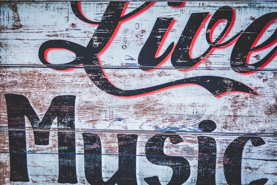
Creative typography has been popular in the past few years and that trend continues. Fonts are getting larger and more creative, and text is getting more of the screen to itself – often taking up large blocks of the page.
In the past fonts have been limited by screen resolutions. Most users had low resolution screens which made fancy fonts difficult to read. That’s not the case anymore. Even most smartphones have a resolution well above 1080. This opens up possibilities for creative font design. This means more serif’s, vintage, retro, and even custom fonts. Just be sure to keep it readable.
Larger, Bolder

Many designers are using larger typography for headers and logos to help create contrast and make the content look more interesting. This can be seen in themes like The 7 (The Creative Agency demo shown here). Popular blogs are using larger and modern fonts. For example, Elegant Themes just updated their website for a cleaner look and are using sans serif (a Google font called Poppins) for their headers and titles. WPMUDEV continues to use sans serif fonts (Monaco). Both use large titles.
Text is becoming animated, highlighted with color, etc. Typography is being used within backgrounds. I’m seeing more drop-caps than ever before. I suspect as designers focus on how the typography layout looks on screen we’ll see more multi-column layouts with overlapping images, drop-caps, headers, etc. I’m also seeing larger fonts being used. I’ve also seen fonts used more creatively within layouts and sometimes having a large portion of the screen to itself.
Font Pairing
Font pairing is the science of matching typography to the content. Many websites simply use the default font that came with the theme. Using font pairing, a designer will match the font to the genre they’re best suited for. This will actually help in communicating with the audience. Font pairing makes the site look more professional and I expect to see it become more popular in 2017.
For a great resource on font pairing see the articles
Let’s Discuss
- Do you use large fonts?
- Do you prefer fonts that are more creative?
- Have you tried font pairing?
Let us know in the comments. Thanks for reading, and please subscribe if you haven’t already.
Featured image by Clem Onojeghuo
[/et_pb_text][/et_pb_column][/et_pb_row][/et_pb_section]

Leave a Reply