[et_pb_section bb_built=”1″ admin_label=”Section” fullwidth=”on” specialty=”off”][et_pb_fullwidth_post_title admin_label=”Fullwidth Post Title” title=”on” meta=”on” author=”on” date=”on” categories=”on” comments=”on” featured_image=”on” featured_placement=”background” parallax_effect=”on” parallax_method=”on” text_orientation=”center” text_color=”light” text_background=”on” text_bg_color=”rgba(0,0,0,0.5)” use_border_color=”off” border_color=”#ffffff” border_style=”solid” custom_padding=”320px||320px|” title_font_size=”52px” title_font_size_phone=”42px” title_font_size_last_edited=”on|phone” /][/et_pb_section][et_pb_section bb_built=”1″ admin_label=”Section” fullwidth=”off” specialty=”off”][et_pb_row admin_label=”Row” make_fullwidth=”off” use_custom_width=”off” width_unit=”on” use_custom_gutter=”off” allow_player_pause=”off” parallax=”off” parallax_method=”off” make_equal=”off” parallax_1=”off” parallax_method_1=”off” custom_padding=”40px|80px|40px|80px” parallax_2=”off” parallax_method_2=”off” custom_padding_tablet=”20px|0px|20px|0px” custom_padding_last_edited=”on|phone”][et_pb_column type=”4_4″][et_pb_text admin_label=”Text” background_layout=”light” text_orientation=”left” use_border_color=”off” border_color=”#ffffff” border_style=”solid”]
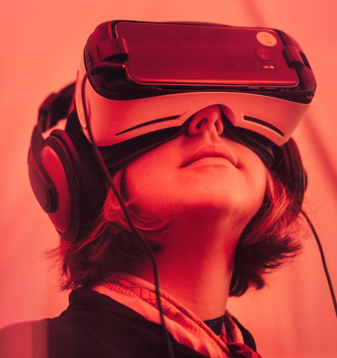
If you think about it, the web is actually a 2D alternate reality. The next obvious step is to shape it into a 3D virtual reality. VR headsets for smartphones are becoming popular, and both desktops and mobile devices have ways of displaying VR. It makes sense when you consider the advantages. For example, you could stand in a room you’re considering renting or buying, stand on a vacation spot to help make your decision of where to spend your vacation time, view a product and see it from all angles without having to be in the store, and so much more.
Here are some of the popular ways that VR is being incorporated into WordPress.
Google VR view

Google VR view is becoming popular and incorporating VR features into WordPress and apps. It let’s you embed 360 degree VR media for desktop and mobile devices. It supports mono and stereo images. Images can be stored as JPG, PNG, or GIF. Video can be stored as MP4.
Plugins
It’s still in its infancy but currently the easiest way to incorporate VR into your WordPress designs is by using a plugin. Here’s a look at a few plugins to add VR to your WordPress website.
WP-VR View

WP-VR-view is a free plugin in the WordPress depository that lets you add a photo sphere and 360 degree video to your WordPress website to create 3D panoramas that readers can navigate through. It includes lots of shortcodes for videos, images, preview, width and height, and stereo. It works in web browsers and on mobile devices including Google’s Cardboard.
Web VR Shop

Web VR Shop is a premium WordPress plugin for WooCommerce that allows you to add 3D models to your shop. Upload your 3D model and then scale, position, rotate, and change the background color with easy to use sliders to create a VR product gallery. It includes multiple 3D extensions. It works on desktop, mobile, Rift, Cardboard, and Vive.
Let’s Discuss
- Do you use VR on your website?
- What’s your favorite way to incorporate VR into WordPress?
- What’s your favorite use of VR?
Let us know what you think in the comments. Thanks for reading and please subscribe if you haven’t already.
Featured image by Samuel Zeller
[/et_pb_text][/et_pb_column][/et_pb_row][/et_pb_section]