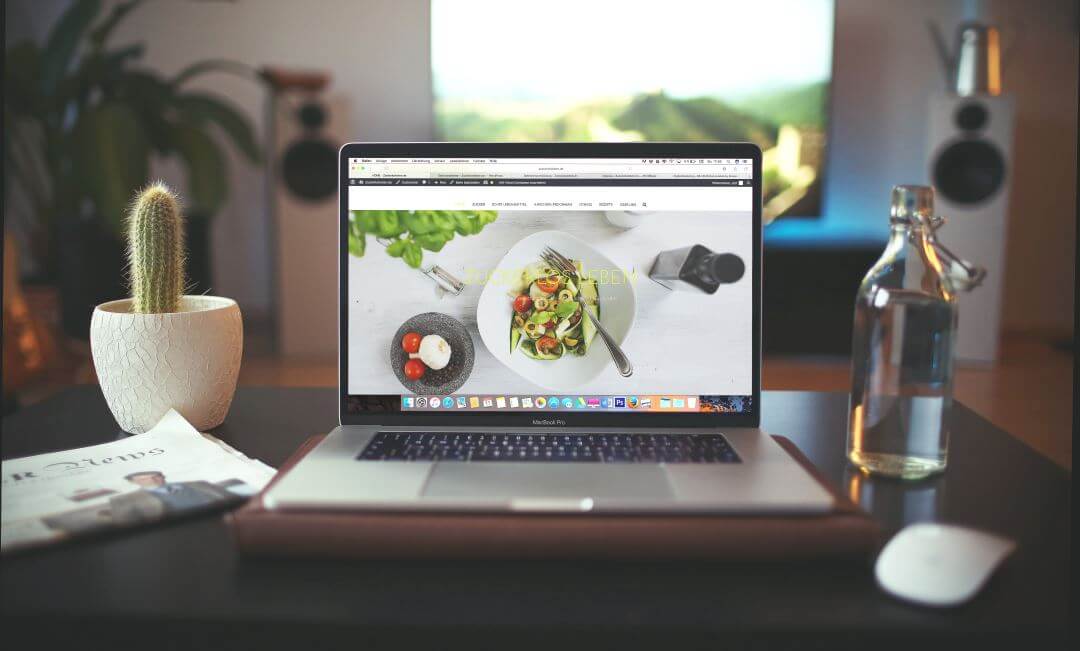
The header is often the first thing your visitors see when they land on your website. This means your header is your website’s first impression for your readers. You know what they say about first impressions. This is your first chance to wow your reader, capture their attention, and keep them on your website.
This design element can tell your readers about your website. It can say “I’m serious”, “I’m light-hearted”, “I’m intelligent”, “I’m trustworthy”, etc., just from the use of color or images. Needless to say, this is an important aspect for your website.
Header Elements
The typical header contains elements such as:
- Logo
- Navigation
- Tagline
- Color for mood
- Image
- Animation
- Call to Action
- Video
- Social Buttons
- Contact info
Your header needs to be responsive, clean, informative, and useful. It shouldn’t be slow loading, eye-piercing, or confusing. Many WordPress users keep the standard header for their theme without customizing it. They work, but they don’t stand out from the crowd. Better header design requires a little bit of customization. Most customizations can be done with the theme’s built-in features, by adding your own code, or by using a simple plugin.
Let’s look at a few good headers.
Examples of Good Header Design

This is Divi Cafe (a Divi demo). The colors work perfectly for a cafe. I especially like the dark overlay with the background showing through the text. Navigation is easy to see and understand. I can tell at a glance that I can make a purchase because of the shopping cart. The image of the cafe can be seen through the overlay and it’s just visible enough to tell me what the website’s about. The logo appears above the menu on scroll. Both the menu and logo change to a lighter, but still elegant, color.

Of course this is only one of the types of headers that you can make with Divi. Choices include vertical or horizontal navigation, full screen and slide-in navigation, unlimited colors, transparent headers, left aligned or centered logo, hide navigation before scrolling, add video, adjust the header height, change the fonts, and lots more.

Another option is to use a plugin such as Awesome Header. It’s a plugin that replaces the standard WordPress header. You can add images, adjust colors, fonts, create sticky navigation, and lots more.
Where to Get Ideas for Great Headers
My two favorite places to get ideas for headers is searching on Pinterest and looking through theme examples. The theme examples can be any kind of website theme including WordPress, Wix, etc. I like looking through themes with pre-made layouts on ThemeForest, child themes for platforms such as Divi, etc.

The example above is a Pinterest search using the keywords website headers. I like to pin my favorites and come back to them for ideas.

This is a look at some of the pre-made layouts for BeTheme. When something catches my eye, I’ll click on it and start making notes.
Let’s Discuss
- What’s you favorite method for designing headers?
- Do you use the features in your favorite themes, use a plugin, or use code?
- Where do you get your ideas for header designs?
Let us know what you think in the comments. Thanks for reading. Please subscribe if you haven’t already.
Image by Igor Miske


Leave a Reply