Divi has recently gone through a series of updates and one of those updates added some interesting background features including gradients. As you may know, I’m partial to gradients (see the article WordPress Design Trends 2017 – Gradients) and I see them becoming more popular throughout the year. As you can imagine I was excited when I heard that Divi was getting a gradient tool. Does it meet my expectations? In this review we’ll take a look at the new gradient tool as see what it can do.
(Note – this article contains affiliate links to help keep this site running)
Background Settings

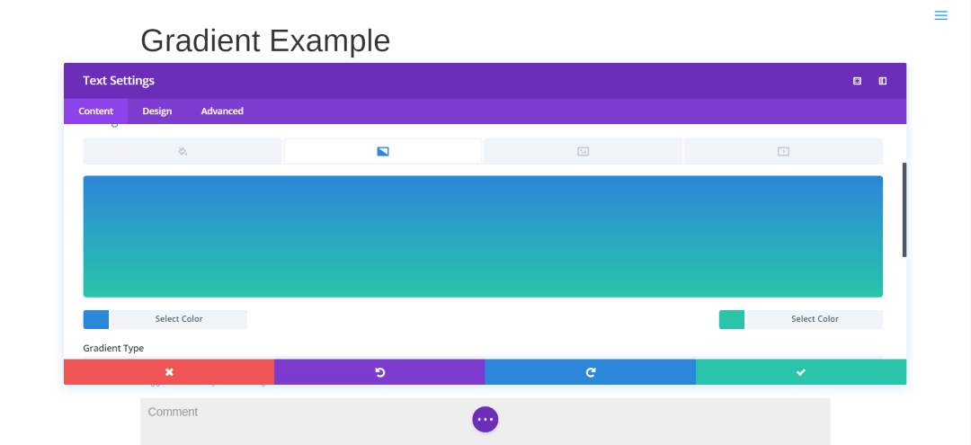
The new background settings includes four tabs: Color (for solid colors), Gradient, Image, and Video. Gradient is the second tab. To create a gradient, click the plus in the center.
Visual Editor Example

You’ll see the default gradient with two colors with boxes labeled Select Color. Click on these boxes to choose your colors.

From here you can move the circle to the color you want or select the color from the circles at the bottom. Once you’ve chosen your color you’ll see the hex code that you can copy if you want. You can also paste hex codes into the code field. If you move the circle, a circle will appear filled with the color to help you decide if that’s the color you want. The sliders on the right change intensity and opacity.

Once you’ve chosen your first color, select the box for the second color and make your choice.

Once you’ve chosen your colors select somewhere outside the gradient color box and you’ll see your gradient. If you don’t like the colors you can select the color boxes and choose another color.
Gradient Settings

Under the gradient is a section with settings that include Gradient Type (choose from Linear or Radial), Gradient Direction, Start Position, and End Position. These controls allow you to change the direction the gradient flows and how the colors blend together.

You can even keep them from blending if you want. Playing around with the controls can create some interesting backgrounds.

Choosing Radial gives you another set of options called Radial Direction which includes center, top, bottom, left, right, and several combinations.
Image Blend

You can even place a gradient over an image using the Image Blend tool. Click on the Image tab and load the image you want. Go to the drop-down box at the bottom called Background Image Blend and select Overlay. Your gradient will appear over the image as an overlay. (I took this photo of a log cabin at Cades Cove here in TN).

You can adjust the gradient controls to create some interesting effects. You’ll see the results in real-time.
Thoughts on the Divi Gradient Tool
The gradient tool is intuitive to use. It’s easy to create and modify gradients. There are enough adjustments and features that you can create dozens of gradients and none of them would look alike. You can even have a different gradient for each column in a row. You can place the gradients over images, which opens up a lot more possibilities. For example, you could use an image of a texture behind your gradient. By themselves the gradients are visually interesting. Throw images into the mix and the possibilities are endless. Since they’re created within the modules you can save the module to your library and reuse the gradients.
The gradient tool is fun to play with. I like adjusting the colors to see what I can create and I like seeing how they look over the images. The gradient tool is a welcome addition to Divi and I highly recommend using it for your designs. Now, if they were to throw particle animation in there I would probably not have time to write.
The example shown uses the text module. The background options are also available in rows, sections, and many other modules. The background gradient tool comes with many of the modules in Divi, Extra, and the Divi Builder plugin. You can get them at ElegantThemes.com.
Let’s Discuss
- Have you tried the Gradient tool?
- Do you prefer using Divi’s gradients or something else?
- What features would you like to see added to the gradient tool?
Let us know what you think in the comments. Thanks for reading. Please subscribe if you haven’t already.
Disclaimer – I am a contributor to the Elegant Themes blog. I am also a customer. This in no way affects my opinion of Elegant Themes’ products. I take pride that all of my reviews are unbiased and fair. Honesty and credibility are my highest priority.


Leave a Reply