
Pykmax UPP is an ergonomic guitar pick holder designed to ease pain and help keep guitar players from dropping their picks. It works for both right and left-handed players. In this article, I review Pykmax after one year of use.
This product was purchased for personal use. This article includes affiliate links.
Who Pykmax UPP is For
Pykmax is not for every guitar player. Not everyone will feel comfortable holding something in their hands while strumming. One of the advertised advantages is that it keeps you from dropping your pick. Practically every guitar player will drop a pick when starting to play the guitar, but holding something of this size in your palm is not the best answer for that problem. It’s easy enough to tape a few picks to your guitar, strap, or mic stand.
Who Pykmax really helps is anyone that has trouble gripping a pick due to hand pain. There are other products that hold picks, but none worked well for me. Pykmax has worked well for me for over a year.
Note- This article isn’t meant as medical advice. If you have hand pain when gripping a pick, I recommend seeing a doctor and only using this review as information.
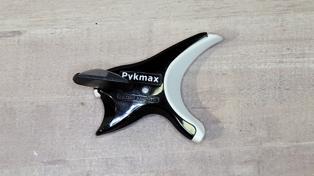
Pykmax UPP


The Pykmax UPP system is different from the other pick systems that didn’t work for me. The pick is held by an ergonomic grip that fits comfortably in the hand. Your fingers hold the pick and have “mostly” full control, but you don’t have to pinch the pick with any effort.
The Pykmax grip is adjustable to work with righthanded a lefthanded players. Simply move the pick to the other side by holding the grip and pushing on the edge of the pick in the direction you want to move it.
It comes with a small, medium, and large extender so there’s something to fit any hand size. The medium extender is installed by default. This is the one I use and it will fit most hands. You can change them by applying a little pressure to remove the extender. The new extender pops into place with ease and it holds in place well. I did find it a touch difficult to remove the extender at first.
It comes with two pick grips. These are the rubber pieces that hold the pick in place. It uses standard picks, so there’s no need to purchase picks from the company. I never had to replace my pick grip, but I was concerned that it would tear where it’s attached to the extender. It does seem to be a weak area, but mine never tore.
Pykmax UUP uses the most common shape guitar picks, which are not included. The guitar pick slides into the rubber sleeve. It can be a touch difficult to get the pick in or out, but it holds into place well. Picks will not fall out of the sleeve.
Pykmax UPP Build Quality
The Pykmax grip is tough. It’s made of hard plastic that doesn’t feel like it will come apart. The extender sits tightly into the grip holder. It will come apart easily enough if you use something to press into the hole that it latches onto. The rubber piece that holds the guitar pick concerns me, but I’ve used it for a year with no issues and it does come with a replacement, just in case.
Playing Guitar with Pykmax UPP


Holding the Pykmax UUP feels like having your finger on a trigger. Your finger sits on the trigger, but this places the pick where it needs to be. All you have to do is place your thumb on top of the pick. This gives you control of the pick without having to apply pressure to hold it. You can hold the pick anywhere you’d normally hold it to have as much or as little of the pick extending beyond your fingers.
This does feel a little awkward at first, and it never feels as good as not holding a device in your palm while holding a guitar pick. However, it’s not difficult to use or get used to. Strumming is easy enough. Some lead tricks take a touch more concentration, but I was able to do anything that I normally could do while just holding a pick.
I Can Play the Guitar Again
A little over a decade ago I started to feel a burning in the palm of my hand when I pinched the pick. I’d sometimes press through the pain, but it became unbearable. I’d want to drop the pick and strum with my fingers, but I was never comfortable growing my nails to play, so strumming an electric guitar with my fingers didn’t work that well for me.
Recently, the pain became too much to bear, so I looked for an alternative. I tried guitar pick systems that held the pick onto your finger with a band. It wasn’t comfortable and the strumming didn’t feel natural. Some required specially cut picks that broke after a minute of playing. After wasting money on cheaper systems that didn’t work, I spent $29 on a Pykmax and I’ve used it ever since.
Conclusion
Of all the pick systems I tried, Pykmax is the only one that actually worked for me. I can play guitar again. The pain isn’t always 100% gone, but I can play for an hour or more without wanting to drop my pick and play fingerstyle. It worked instantly. It didn’t take long for me to appreciate Pykmax.
The Pykmax has recently gone up to $40 on Amazon. I was skeptical about buying it for $30, but even at its new price, I’d buy it again. Is it worth $40? It is if your hand hurts when gripping a guitar pick and you want to play guitar without the pain.
Where is Buy Pykmax UPP
You can purchase Pykmax UPP on Amazon. Here’s my affiliate link. If you get it, please let me know how you like it.
This product was purchased for personal use and review. The company did not ask me to review this product or provide a positive review.


