[et_pb_section bb_built=”1″ admin_label=”Section” fullwidth=”on” specialty=”off”][et_pb_fullwidth_post_title admin_label=”Fullwidth Post Title” title=”on” meta=”on” author=”on” date=”on” categories=”on” comments=”on” featured_image=”on” featured_placement=”background” parallax_effect=”on” parallax_method=”on” text_orientation=”center” text_color=”light” text_background=”on” text_bg_color=”rgba(0,0,0,0.5)” use_border_color=”off” border_color=”#ffffff” border_style=”solid” custom_padding=”320px||320px|” title_font_size=”52px” custom_padding_tablet=”220px||220px|” custom_padding_phone=”120px||120px|” custom_padding_last_edited=”on|phone” title_font_size_phone=”42px” title_font_size_last_edited=”on|phone” /][/et_pb_section][et_pb_section bb_built=”1″ admin_label=”Section” fullwidth=”off” specialty=”off”][et_pb_row admin_label=”Row” make_fullwidth=”off” use_custom_width=”off” width_unit=”on” use_custom_gutter=”off” allow_player_pause=”off” parallax=”off” parallax_method=”off” make_equal=”off” parallax_1=”off” parallax_method_1=”off” custom_padding=”40px|80px|40px|80px” parallax_2=”off” parallax_method_2=”off” custom_padding_tablet=”20px|0px|20px|0px” custom_padding_last_edited=”on|phone”][et_pb_column type=”4_4″][et_pb_text admin_label=”Text” background_layout=”light” text_orientation=”left” use_border_color=”off” border_color=”#ffffff” border_style=”solid”]
Footers are rarely seen in today’s websites. They not getting the love they used to because readers are not scrolling to the bottom of pages anymore. To find out why, I did what any web designer would do – ask random people on the streets.
Random Guy
“I don’t scroll all the way down,” said a random guy I met on the street, “because all that’s down there are hit counters and Flash animation. Besides,” Random Guy continued, “why scroll all the way down there when I can look at all of the shaking ads in the sidebars? I was the 100,000th visitor to every website I visited last week. That makes me kind of a big deal. They should be paying me…”

Unfortunately our conversation was cut short, but Random Guy does make a good point. However, it’s not the 1970’s anymore and anyone who’s scrolled all the way to the bottom of a website in the past few months has noticed there are some really good designs in those footers. Designers want their readers to see those footers. Afterall, all web design is art, they put a lot of time into them, and the art must be viewed.
Google Rep
To help with this, Google has developed the upside-down website. “It just makes sense” said the Google rep, “since the goal is to get your readers to the bottom of the page… to just go ahead and start there. Plus, we have to do something new or the web is going to explode due to the 2018 web bug (which we don’t want to talk about).”
The Google rep wanted me to strike that last comment but I used parenthesis instead. I hope he appreciates it.
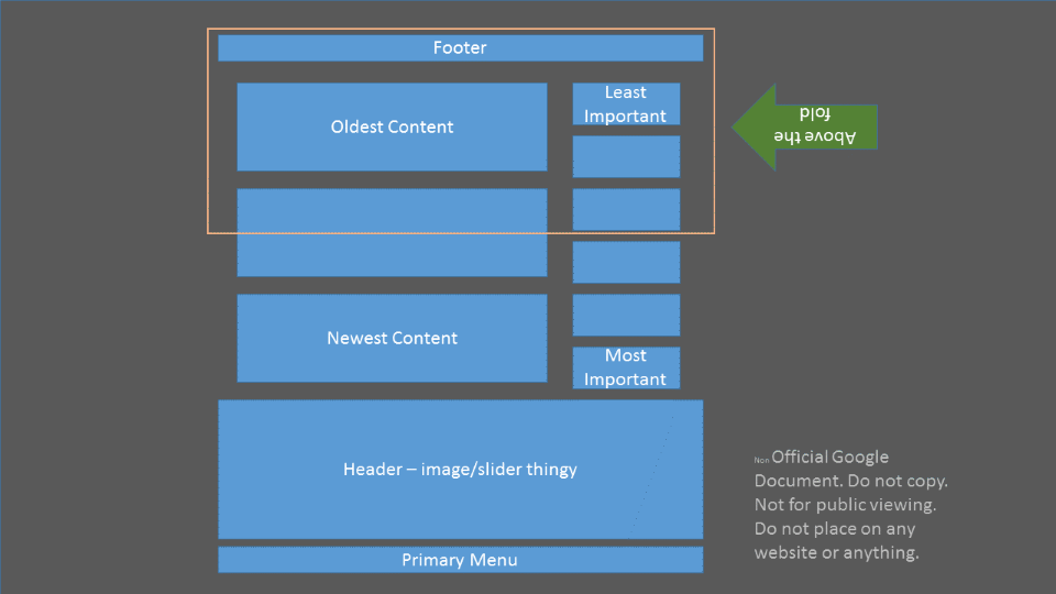
Google’s Upside-down Web Design Standards
Here’s a look at a blog design using Google’s Upside-down Web Design Standards.

As you can see… it’s… well… upside-down. The text and images are in the proper direction, but the footer is on top, followed by the oldest to newest post, and then the header and primary menu.
Well it looks like we’re in for some interesting designs when the Upside-down Tool Kit is released later in the year. Until then, happy designing, and have a great April Fools Day!
[/et_pb_text][/et_pb_column][/et_pb_row][/et_pb_section]